Killing Facebook softly – and asking how can I sell them my data instead?

Analogue-columns

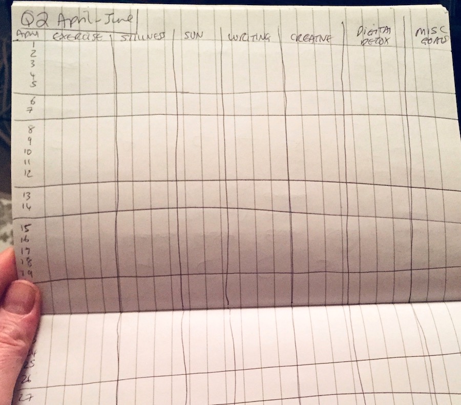
This year I've been trying to form better habits through what I jokingly refer to as my 'Analogue Columns Lifestyle Planner Tool' – basically a daily set of columns in a notebook for ticking off stuff I want to do more/less of. Most things have been going pretty well – apart from the digital detox column. It was just way too easy to ignore Screentime warning limits on my Facebook, Twitter and Instagram apps.

Until this week – I had a breakthrough. A moment of empowerment and action that has been a long time coming.

It happened after reading about how (yet another) 540 million Facebook records were left exposed due to sloppy third-party developer security and then listening to Grahan Cluley's Smashing Security #75: ‘Quitting Facebook’ podcast (on the same link).

One of the lines in it was about how we all hate being on Facebook but can't quit it because of FOMO (fear of missing out). Who wants to be in that resentment-filled situation of not being able to leave?

But it's so true. My own FB addiction is based on social glue, comment witticisms, creating diary-style timehop memories and social calendar notifications (and some work stuff). Which is fine but it also sucks me in beyond this as I scroll the newsfeed and feel compelled to comment or click 'Like' a few times a day (hundreds or thousands of interactions a year), each taking a moment that also adds up.

In fact, according to my Screentime stats, the whole scroll and respond is adding up to an astonishing eight days a year, and that's just on my Facebook phone app. If I add in all my other phone interactions, including calls and text messages, it multiples to around six weeks a year. SIX WEEKS!

And, the thing that galls, of course, is that this time and information has value. Ultimately I am the product for FB. Each interaction is building up my profile for FB advertisers and I have now handed over more than a decade of details about my life and thoughts for FB to sell on. I think we all deserve a cut of these ad profits. The free service is no longer a fair price for users.

So I've done three things to contain Facebook without losing out on the things I like. They took a few minutes to do but should make a massive difference.

  1. I went through all the privacy settings, disabling Facebook's app platform and turning off all the default 'on' stuff.
  2. I deleted my phone apps for Twitter and Facebook. This was the big one. Firstly, a lot more tracking can happen through phone apps. Secondly, the phone is always there in my pocket and is just too easy a temptation, like how biscuits start calling when you pour a tea.
  3. I moved Facebook on to Firefox browser and put it in an extension called Facebook Container to essentially neutralise its data hoovering powers. The extension "isolates your identity into a separate container and makes it harder for Facebook to track your activity on other websites via third-party cookies". Mozilla does not collect data from this – it only knows the number of times the extension is installed or removed. So all those Like buttons on pages around the internet won't now track my browsing, which feels very freeing.

There are other tricks – Chrome users can get their FB feed replaced by an inspirational quote, for example. But I'm kind of interested to see how my newsfeed changes based on my detox. And I like to see friend's news. And I don't want to use Google's Chrome.

So how about the monetary aspect of getting some of the financial value of my data for myself?

After being part of The Glass Room in London in 2017, I've been intrigued by the idea of selling my data to advertisers.

This is not a new idea but this week I've been inspired by Jean Guerrero's article in Wired on how maybe we are all targeted individuals and what this is leading to.

Towards the end of this long read, she talks about Jaron Lanier's idea that:

"we should demand payments for data that companies collect from us. He envisions a world in which we are compensated for every profitable datum we provide, with payments proportionate to the profit they produce. He argues that such a world—in which we value the humans behind data as much as the data themselves—would lead to a new era of economic prosperity, equality, and freedom."

Who couldn't do with some of that?

At the moment it's only an option to restrict access or quit the platform. A container for my personal data and Facebook interactions seems a good first step towards pushing back and sends a message to FB (which still holds all my past data, even if it is less useful from now on).

But why not offer us the option to be both the product and the customer?

I guess because we all give ourselves too freely for Facebook to offer us any other deal; we don't value our data and often have a 'who cares?' attitude to posting on these services.

But if users could have customisable permissions and data access for a price, what then? I would love to reverse the Facebook business model and target advertisers willing to pay for access to my demographic. Might this not be something FB could monetise, too? After all, they are a data broker – and surely that can work both ways.


Hire/commission me: fiona [at] fionacullinan.com


How to start a data privacy conversation in your city – a bulletpoint guide

This guide forms the end documentation for my recent Mozilla Open Leaders project which culminated in launching a regular data privacy email for Birmingham, UK. If you want to do this in your city or region, I hope it will be useful info to get you started. And if you have any follow-up questions as you go, email me at observedcity@pm.me and I'll do my best to answer and update the guide.

NOTE: You don't necessarily have to follow all the steps below but I really do recommend starting with an Open Canvas as a way to unpack the ideas in your head into something more practical and workable.

Image: (CC) Michael Coghlan/Flickr

Short term (research & development)

  • Fill out an Open Canvas outlining your aims for the project, the problem you are aiming to solve, the needs and resources, and target users and contributors. Here is an example showing the open canvas for ObservedCity
  • Content calendar – compile list of events and online activities in your area (data privacy, data research, art, tech, activism). Place events under each month on a calendar doc; extract interesting people and organisations for potential contacts. Subscribe to newsletters that are relevant to your project.
  • Contacts/network list – find everyone you should connect with in your area who are working with data/privacy in some way or run relevant events: university researchers and academics, privacy activists, digital artists, curators and galleries, a local Open Rights Group, Meetup.com groups, Chamber of Commerce, local government initiatives helping businesses with big data, 'smart city' groups, police and neighbourhood alerts, potential contributors, hacker groups, coding clubs, local Mozilla Campuses, tech drinks and meetups, open data groups, relevant social enterprise startups, ImpactHub, collectives and coops, event organisers.
  • Research email providers – how will you distribute your email? I looked Mailchimp and Tinyletter's pros and cons. I chose Tinyletter for a more personal curated feel and an easy introduction to email setup; I may move to Mailchimp if I change the tone or go in a new direction with the content.
  • Decide on the title of your newsletter – does it need to work across other platforms, such as a website or social media? If so, check the name is available for use in these environments. Look for a name that suggests the content, eg, Observed.City suggests surveillance, privacy and that I'm looking at what is happening in my city. Try to choose a memorable and engaging name – maybe avoid the word 'data' as this can make for a dull word that turns people off subscribing. If you want to keep it hyperlocal, add the name of your area or city into the title of the newsletter; if you want to potentially reach a wider audience, this may be limiting. Sometimes you don't know what your project is going to be until you start – it's ok to change the name later; the important thing is to start!
  • Decide on regularity – this will depend on your resource/time but you could do a shorter email weekly, a medium email monthly, or even quarterly. I'm aiming for every 3-4 weeks and trying to keep it shorter
  • Expertise, experience and mentors – if you don't know how to start a newsletter or how to build a community of subscribers, find and talk to people who have done it. For example, I took the editor of IChooseBirmingham listings email (17,000 weekly subscribers) for coffee and learnt more in an hour than I ever could have learned online (thankyou Tom!). You may even be able to find a mentor of whom you can ask questions as you go along. Meeting people in real life both helps build community and gets experienced people on board with your project.

Medium term (set up, soft launch)

  • Consider setting up a new email account if you want to keep your newsletter project separate from your personal/business email. I used Protonmail and the name of the project: observedcity@pm.me – unfortunately this caused some delivery issues in Tinyletter as Protonmail is very tight on its privacy and was triggering spam alerts, so I had to change it to an alternative email that did work.
  • Set up a newsletter account with your chosen service – go through all the account settings and fill in any blanks.
  • Set up related accounts, eg, a Twitter, Facebook page and website for your project – these may form your future discussion/comment/feedback areas and somewhere to upload blog content. You can keep it basic for now but it still takes some time to set up, to write the about/bios, add links to your project, upload a picture or logo, and cross-link between these different sites.
  • Decide on the format of email and content to include – what kind of things do you want to write, what does your target audience want to know, how will you make it engaging and easy to read, do you need images, do you want to have an informal conversation tone or a more professional corporate style, what do you like in the newsletters you receive, what makes you open these?
  • If working open (as I did on this project), create your Github repo or shared Google doc, and start to document your project – what it is about, how people can contribute, how the work is licenced, issues you need to resolve, etc. Here is the ObservedCity repo so you can see and fork/duplicate the content.
  • Start to build community – both users and contributors – start to connect and follow your contacts list through social media channels, subscribe to their newsletters, network at events, tell people about your project, email people directly if you think they will be interested, consider arranging a coffee meet with potential contributors.
  • Logo/header – basic design – there's a lot you can do with editing software, such as Preview and Photoshop, to get a look/feel for your newsletter's title. You can also source Creative Commons images for use in your headers/banners, for example, I used a great free image from Pixabay in return for buying the photographer a virtual coffee.
  • START! Do a first draft so you can visualise what your newsletter will look like and how much time it takes to create it. Send yourself a test email. Get a friend to read it over with their fresh eyes. Amend, check links work and finalise. At this point, if you like what you've done – why not send it out and start to get feedback and subscribers? You could also do a soft launch where you send it to a small group of people – friends/family – to get their feedback. Getting the perfect newsletter takes time – months and years even to build up a community of readers. Don't get too bogged down in the set-up phase – you can iterate and improve as you go.
  • Note: I have a background in publishing so I have a basic understanding of media law around issues such as copyright, plagiarism and defamation (libel), and data protection. I recommend you read up on these and your country's laws around publishing in order to protect yourself.

Long term (launch and beyond)

  • Update and monitor Github repo – submit project and requests for help to hackathons: the Global Sprint, Hacktoberfest, etc.
  • Logo/header – outsource design for a more professional look (try posting this request as an issue for open working during #mozsprint or other hackfests – that's how I got logo suggestions/design help).
  • Populate online content areas – ideas for content, attend and review events, seek editorial contributors, ask for help via social media, create original content.
  • Refine/improve launch email – ask for feedback and iterate.
  • Remember to thank your contributors!
  • Community building / outreach work – how can you get your newsletter to interested people and reach different communities in your city? Consider adding a guest section and asking for different voices and perspectives.
  • Scale – sign up for similar newsletters in other cities, start to connect as a network. Talk to local media, offer a help feature on data privacy.
  • Sustainability/governance – find guest editors and proofreaders, check resource/times, regularity of email.

Launching Observed City and learning to work open with Mozilla

Click to view (opens in new tab) – my short demo starts at 3 mins 20.

I'm very proud to say that I've just graduated as a Mozilla Open Leader. In a nutshell this means that I've spent the past 14 weeks learning how to work openly and inclusively as part of a cohort of 20 projects from around the world. The next round of Mozilla Open Leaders will be opening in June and I highly recommend applying if your project fits the criteria. Here's why…

For me, some of the best things about the programme were working with an experienced mentor (mine was a radio astronomer from Jodrell Bank!), dedicated access to experts in topics ranging from cybersecurity to community building, and being in online breakout rooms with other project leaders from North America, Europe, Asia and Africa.

There's really something quite humbling and amazing about getting feedback on your Github Readme page from a professor in Addis Ababa or an activist in Hungary.

Of course, it also provided much-needed forward momentum and weekly mentoring deadlines to bring my idea to fruition (background and how it all started here).

To that end, I'm pleased to say that Observed.City – a new data privacy newsletter for Birmingham, UK – is now up and running. If you're based in Birmingham or the wider West Midlands, working with data in some way as an academic, artist or activist, or just want to know more about data privacy and how to stay safe online, please subscribe here.

Observed.City soft-launched in March 2018, in the week of the Facebook/Cambridge Analytica scandal, just as the issue of mass data collection was propelled into the mainstream. It comes out every three to four weeks and highlights a small number of data stories and privacy issues of individual-local-national-global interest, as well as listing relevant events happening in the city.

I'm now working on Issue 4 and already have several contributors, as well as a guest section so that I can bring different people, experiences and voices into the mix.

Want to get a copy? Here is the sign-up link.

Want to contribute? Here is the project repository, which tells you all about the project in the ReadMe file and lists open Issues where I'm looking for help. Or you can email me about the guest slot or with any local event details at observedcity@pm.me.

The project also launched at Mozilla's Global Sprint hackathon/helpathon in early May, where people from around the world were invited to contribute to the project in a number of ways. As a result, I now have a logo design and am in the process of turning the experience in a more general how-to guide for kickstarting the data privacy conversation in other cities. Update: it is here!

Ultimately the aim is to keep working openly and perhaps start to pass the project on in a few months to other interested writers and editors who can help it develop in new ways. That should keep it interesting.

Dataviz first attempts

Having wrestled with a significant number of roadblocks for what is a fairly straightforward dataset, I am happy to announce the birth of my first data visualisation comparing 2011 figures for the percentage of women in the boardroom across a number of different countries. (Data source: Grant Thornton International Business Report). This is just a tester graphic, though. I now have to figure out how to show this over time, and with many more countries, and on a world map. *Gulp.*

Women in Senior Management 2011 Many Eyes

Update: I have added in the rest of the 2011 data by country so that it can be represented on a world map. Can't seem to customise the horrible brown colour though.

Women in the Boardroom 2011 Many Eyes

Now to try adding in extra maps to show the data in different years…

[Tum-te-tum.]

Less than 15 minutes later, the rest of the data is input and a graphic created which shows the state of play for senior women in business since 2004. You'll have to click through to see this in action. Either click 'All' maps in the toolbar above the map, or select by year from the dropdown menu bottom left.

Women in the Boardroom 2004-2011 Many Eyes

Phew. Logging off now and going to pub.

Why dataviz eats my brain

DataVisualizationChart_blog.jpg


I keep getting drawn into dealing with infographics (didn't they just used to be called graphics?). Which is fine. They are content and, after all, I am a content producer. The problem is that I appear to be seriously rubbish at them. In fact, they can make me feel downright inadequate.

Either I can think up the idea but I'm then left to the mercy of the search engines as to whether I can find relevant statistics to support it. Sadly, it turns out that researching data driven by an idea is a rather hit and miss affair.

Or, being a writer first and foremost, I don't think particularly visually – which makes it impossible to make smart choices or judge the level of difficulty and resource it'll take to deliver my suggestion.

Full. Of. Fail.

I used to think infographics were really the design department's gig but, in reality, the designer is also being asked to step outside their comfort zone and both collect data and then analyse it to check that it will work in practice. They can be great designers but poor data analysts.

Even they may not know the answer. If it is an interactive graphic, then a web developer needs to come on board with their input – at which point the idea may get derailed once more. The result?

Infographics are a time-suck.

And that's before production begins. Even more frustrating is that I can never type the word without writing INFORgraphic – the word is devoid of keyboard muscle memory and since I have to type it a lot (because of all the freakin' collaboration involved) it makes my teeth itch. Or is this just me?

So why am I blogging about something I am so bad at?

Because there is an infographics gold rush on right now and it shows no signs of ending. This is probably because:

(a) we are exploring the possibilties of digital content
(b) because users don't want to read a wodge of text so this needs to be broken up somehow
(c) complex ideas often benefit from simple visuals
(d) they make great linkbait

And we're not just talking simple representative graphics but interactive, multimedia, story-telling, motion graphics that drill down into different elements to tell the story of the data.

Note: the user will probably still need a guided tour of the infographic.

Many pretty visuals are just that. Lovely to look at but unfathomable. Even good ones usually benefit from a caption or summary title. This is where I as a web writer come in again – I provide the contextual link for readers to understand the graphic's key points, a sort of guided tour for those who don't think visually either or haven't got the time to work it out themselves.

The trouble again is that without getting down and dirty with the production work, I'm often left trying to work out the meaningful points of the graphic myself.

I guess the point I am making is that ideally this task needs to be done or overseen by one person rather than a series of different editorial, design and web dev inputs. And that that person needs to have skills in research, data collection and analysis, visual thinking, design and sketching, Java, Flash, Silverlight and other software, contextual writing, sub-editing and SEO. Otherwise the infographic can fall between the skills gap and cause untold content stress for everyone.

Dataviz requires a weird skillset.

Online data visualisation in particular seems to ask for a greater breadth of skills than most writers or designers can give. Which goes some of the way to explaining why there are a lot of weak examples coming through in my feeds.

Designers need to train up in telling the data’s story, or journalists need to train up in visualising their story. For an example of the (scary level of) skills and tasks required, check out this recent job ad for a data journalist at the BBC.

Until then, the unusual mix of skills required by data visualisation is leading to some great opportunities to fill this niche growth area.

Sadly I will probably not be one of those opportunists. I may have an A'level in maths (including statistics), done a graphic design course and come from a background in journalism – really I should be well set up – but my brain gets discombobulated whenever I have to problem-solve with infographics.

On the other hand, how I wish I could do it!

Resources:

For more insights into data visualisation, check out Journalsim in the Age of Data. It's an hour-long presentation but well worth a view, plus there are lots of resources and links available alongside it.

Also check out Randy Krum of Cool Infographics' guide to designing dataviz.

And this list of 'awesome free tools' and resources.

A TED talk on the beauty of data visualisation by David McCandless.

Finally, be inspired by this periodic table of visualisation methods with examples of different types.

Image: Venn diagram of "What is data visualisation" from FFunction.