Blog

Why dataviz eats my brain

DataVisualizationChart_blog.jpg


I keep getting drawn into dealing with infographics (didn't they just used to be called graphics?). Which is fine. They are content and, after all, I am a content producer. The problem is that I appear to be seriously rubbish at them. In fact, they can make me feel downright inadequate.

Either I can think up the idea but I'm then left to the mercy of the search engines as to whether I can find relevant statistics to support it. Sadly, it turns out that researching data driven by an idea is a rather hit and miss affair.

Or, being a writer first and foremost, I don't think particularly visually – which makes it impossible to make smart choices or judge the level of difficulty and resource it'll take to deliver my suggestion.

Full. Of. Fail.

I used to think infographics were really the design department's gig but, in reality, the designer is also being asked to step outside their comfort zone and both collect data and then analyse it to check that it will work in practice. They can be great designers but poor data analysts.

Even they may not know the answer. If it is an interactive graphic, then a web developer needs to come on board with their input – at which point the idea may get derailed once more. The result?

Infographics are a time-suck.

And that's before production begins. Even more frustrating is that I can never type the word without writing INFORgraphic – the word is devoid of keyboard muscle memory and since I have to type it a lot (because of all the freakin' collaboration involved) it makes my teeth itch. Or is this just me?

So why am I blogging about something I am so bad at?

Because there is an infographics gold rush on right now and it shows no signs of ending. This is probably because:

(a) we are exploring the possibilties of digital content
(b) because users don't want to read a wodge of text so this needs to be broken up somehow
(c) complex ideas often benefit from simple visuals
(d) they make great linkbait

And we're not just talking simple representative graphics but interactive, multimedia, story-telling, motion graphics that drill down into different elements to tell the story of the data.

Note: the user will probably still need a guided tour of the infographic.

Many pretty visuals are just that. Lovely to look at but unfathomable. Even good ones usually benefit from a caption or summary title. This is where I as a web writer come in again – I provide the contextual link for readers to understand the graphic's key points, a sort of guided tour for those who don't think visually either or haven't got the time to work it out themselves.

The trouble again is that without getting down and dirty with the production work, I'm often left trying to work out the meaningful points of the graphic myself.

I guess the point I am making is that ideally this task needs to be done or overseen by one person rather than a series of different editorial, design and web dev inputs. And that that person needs to have skills in research, data collection and analysis, visual thinking, design and sketching, Java, Flash, Silverlight and other software, contextual writing, sub-editing and SEO. Otherwise the infographic can fall between the skills gap and cause untold content stress for everyone.

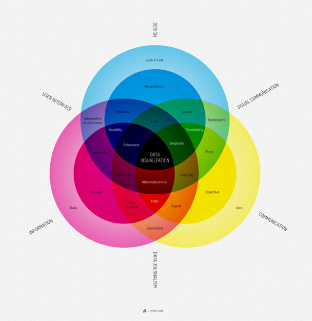
Dataviz requires a weird skillset.

Online data visualisation in particular seems to ask for a greater breadth of skills than most writers or designers can give. Which goes some of the way to explaining why there are a lot of weak examples coming through in my feeds.

Designers need to train up in telling the data’s story, or journalists need to train up in visualising their story. For an example of the (scary level of) skills and tasks required, check out this recent job ad for a data journalist at the BBC.

Until then, the unusual mix of skills required by data visualisation is leading to some great opportunities to fill this niche growth area.

Sadly I will probably not be one of those opportunists. I may have an A'level in maths (including statistics), done a graphic design course and come from a background in journalism – really I should be well set up – but my brain gets discombobulated whenever I have to problem-solve with infographics.

On the other hand, how I wish I could do it!

Resources:

For more insights into data visualisation, check out Journalsim in the Age of Data. It's an hour-long presentation but well worth a view, plus there are lots of resources and links available alongside it.

Also check out Randy Krum of Cool Infographics' guide to designing dataviz.

And this list of 'awesome free tools' and resources.

A TED talk on the beauty of data visualisation by David McCandless.

Finally, be inspired by this periodic table of visualisation methods with examples of different types.

Image: Venn diagram of "What is data visualisation" from FFunction.

My big fat fake wedding

I never thought I would see the day that I put on a brocaded wedding gown (with train, tiara and veil) but somehow it finally happened last weekend. Here I am…

Fiona The Bride 1

This is why I've been absent from my blog (and social life) for so long. There are few things in life that involve such commitment. Two whole months of preparation every Tuesday evening, every Saturday afternoon, then every Sunday too, and finally every day leading up to the big day, or rather weekend. But at least I wasn't alone.

Wedding © Nicola Duke/Bham Opera

It all started a year ago when I fell in love with Birmingham Opera Company after joining the cast of Othello, their nationally lauded contemporary version of Verdi's Otello, set in a warehouse in Digbeth, carpeted like a mosque and featuring a community chorus of volunteer amateur singers. When they started rehearsals in September 2010 for Stravinsky's Les Noces – aka the Wedding – I was there like a shot for another season of 'tra la la'…

Wedding © Nicola Duke/Bham Opera

Stravinsky's ballet was a far more difficult piece to learn, though, despite two months of rehearsing and note-bashing with choirmaster Jon Laird and despite having a CD with our parts sung for us.

As the publicity reads: "The Wedding is a screaming, shrieking, flat out masterpiece with its rhythmic drive and unique sound world- 4 virtuoso pianists on grand pianos, a dazzling array of percussion, 4 soloists and a chorus. Written as a ballet in 1923 for Diaghilev's Ballet Russes, Stravinsky drew on Russian traditions to conjure up a vivid and intense depiction of the old ways, and the not so old!"

I suspect most of the chorus found the musical soundscape of Les Noces quite anarchic with every part seemingly at odds or out of sync with each other. But since Birmingham Opera's director Graham Vick had said that he wanted space to play and experiment (more so than usual), it seemed the perfect piece. Here are the tenors and basses, by the way, instructed by Graham to act like baboons behind a cage sign saying "Please do not feed the grooms"…

grooms.jpg

The setting was the AE Harris factory in Birmingham's Jewellery Quarter – home of Stan's Cafe theatre company. 'Just Married' was daubed in giant red letters across one wall, the paint dripping like blood. Bouquets and wedding photography were poked into factory fittings. The grooms were in their cage, the brides prepping in one of the four main performance spaces (it's a walkabout opera). In the centre were the percussion instruments and four grand pianos. Meanwhile, Frankincense filled the air scenting it like a church.

pianos © Judith Holt

The performances went off differently each time – some electric, some a bit lacklustre, some more musically correct, some all over the shop. As Jon Laird, conductor and choirmaster, said: "We're riding the wave of uncertainty – again." It's the nature of working with enthusiastic amateurs I expect, and part of the challenge to all those involved.

(Jon also said a few other things during note-bashing – his entertaining approach to learning is one of the main reasons the amateurs show up again and again despite all the hard work. His encouragements veer between backhanded compliments, screeching impressions of the sopranos, perfect analogies and random metaphors: "It's hell – and then it suddenly makes sense"; "Good. Good and terrible"; "You're flailing around in a sea of pain"; "Can we have less wicked witch of the west and more heavenly angels please ladies"; "This is a beautiful tapestry of joyous Russian STUFF"; and so on.)

Here are the sopranos being obedient while trying to read the repetitively rhythmic words and also watch Jon for cues.

© Nicola Duke/Bham Opera

Apart from feeling like you're in a real-life version of Faking It, joining the Birmingham Opera Company is a real social event for the participants. The Wedding had 120 in the company; Othello more than double that. Here are my fellow brides and I milling about ahead of the opening scene.

The Wedding

The after-parties are pretty great too… it's where the temporary bar gets drunk dry.

Wedding party -3

I did keep a diary during the making of Othello until it got too busy and manic. I must get around to posting that here or somewhere because I really would encourage anyone who enjoys singing to get involved (next production is in spring 2012). It's a long time to wait though. And at the moment I am full of post-performance MEH! So until then I may as well wallow in these photos of my big fat fake mass wedding and my lovely Sop 1 bridezillas, such as Annabel and Judith pictured here, who got the best dresses by far. Sadly for us the honeymoon is now over.

© Judith Holt

Pictures: © Pete Ashton, Nicola Duke, Birmingham Opera Company and Judith Holt.

Hackybeanpouffe: the rules

Yay, I have found an exercise that I can be bothered to get off the sofa for (and you can play it right next to the sofa so WIN!). Not just discovered but invented; I came up with the concept, Pete Ashton then refined the techniques involved in this brand new sport.

It is called Hackybeanpouffe.

I'll just let that sink in for a second.

Hackybeanpouffe is a cross between hackysack and volleyball, but played with a giant bean-bag type cushion. You get three hits before you must pass it back. It should be played with an imaginary net, preferably to its theme tune (see below).

Although surprisingly aerobic due to the effort involved in manipulating beans mid-air, Hackybeanpouffe can be dangerous – the dust, the dust mites, the heavy aerobic breathing; all of these may contribute to sneezing, stuffiness, red itchy eyes, and possibly an asthma attack.

So Hackybeanpouffe: aerobic but allergenic.

Witness the birth of Hackybeanpouffe on YouTube – and note its theme music Cafe Vixen, by Glatze/Ms Hypnotique, which you can buy for a snip (EP £2.99) from Glatze:

My name is Fiona & I'm a sticker addict

Fuelled by Kanye West's ridiculously wrong Tweet about hating stickers on laptops, I was impelled to blog not just my laptop stickers but also my stickered up old guitar, my songbook, my diaries and any other stuff I could lay my sticky little hands on.

So tonight, I blogged over on Tourist Vs Traveller about pimping travel diaries, only to realise that you can't embed slideshows in WordPress.com. So, because I made one, and because I have an urgent need to share my sticker love, here is it below.

And for the full sticker addiction, you can view all 39 pics here as a Flickr set called, yup, Stickers.


Hire/commission me: fiona [at] fionacullinan.com


Do you want to read what I'm reading? Then read on…

These links are relevant to my interest but have been sitting in tabs for the last two weeks. I will read them, I >will<. But after I've dumped them here. They make quite an interesting view of what has been taking up my time in the last little while. Links as diary entry?

I'm thinking of buying an Android phone…

  • HTC Desire review by TechRadar – five stars, looks good, please tell me if this review is all to cock in the comments though as buying is imminent via Top Desire deals. Or should I iPhone it like the rest of the world?

Festivals

  • CoCoMad is this weekend (July 3, 2010) in Cotteridge Park, South Brum. I have heard it is good. Here is the line-up.
  • I missed it (on purpose) but I'm glad it's being televised. Here's a rant about TV coverage, though: After the flags, the mud-slinging.

The garden

  • The garden has been battered into submission to my will. This rose was planted by my Mum and is the prettiest thing in it: Woburn Abbey floribunda. I heartily recommend this little try-hard. Lots of colours and it flowers repeatedly. All for a tenner. Thinking of getting another one.

Content strategy

UX / IA

Travel and photography

Copyright and fair use

What do the super-rich want to read about?

Memes

  • Know your meme: Jejemon:  "In the Philippines, Jejemon is an internet slang used to describe someone who typEs LyK tHIs."

Blogging (and hyperlocals)

(and from a convo with Talk About Local's Will Perrin in the pub…)

The joy of Creative Commons

…is better parties, social occasions, family life and harmony. Possibly.

Yes, the Creative Commons licensing of your content has the direct side-effect of shareability, clarity and time efficiency of not chasing copyright permissions. But it also has the real-world, real-time impact of more people (hopefully) attending what is a truly lovely family event in Birmingham this weekend. And here's why – in a 24-hour timeline:

Saturday 12.00: Yesterday, I took photographs at a family day out at this weekend's Traditional Edwardian Fete at Winterbourne House and Garden, and as is my habit, set them uploading to my Flickr photo account, during the making of dinner. Here's the set of 60 and also in slideshow format:

Saturday 22.00: After adding a few captions and tags and the like, at midnight I posted the link to the family on Facebook, and then also posted to Twitter.

My tweet about the fete

Sunday 10.00: This morning, I discovered that Nick Booth from my Twitterstream had blogged about my day and posted some of my photos on the Birmingham Conservation Trust charity website.

Birmingham Conservation Trust post

No need to contact me first; the pics were released under Creative Commons Attribution Non Commercial licence.

Creative Commons license

My 50 best Flickr photos 2010

Ooh, just realised I can create a slideshow on Flickr. So while waiting for today's Traditional Edwardian Fete photo set to upload to my favourite photo-sharing platform, here are my top 50 photos (imo). It's a personal pick since joining Flickr in September 2008. And if you don't fancy the slideshow, feel free to browse through the 50 Favourites set on site, photo by gloriously random photo. 😉

For those who need a reason to scoot through, there are pics here from:

  • The desert where Lawrence of Arabia was filmed
  • The murder of crows in my local park
  • A haunted furnace in Birmingham, Alabama
  • Light-painting with an illuminated gyroscope
  • 24-hour Scalextric
  • Rice representations of human populations
  • Birmingham Flickrmeets
  • And neon No Farting sign in a pork ribs shack

And who should open the show but, natch, the lovely Pete Ashton, who was the one who pointed out how easy it is to do a Flickr slideshow. Full circle.

A case study in content strategy?

CSforum10 workshop
Karen McGrane and Rachel Lovinger present a workshop on content audits at CS Forum 2010 in Paris. © Fiona Cullinan/Flickr

Fascinating as Content Strategy Forum 2010 was two weeks ago, one major thing that came out of it was the need for benchmarked case studies that focus specifically on online content strategy, its effects and its impacts on the development and success of a website.

Serendipity landed Kristina Halvorson (queen of content strategy) next to me at lunchtime on #csforum10 Friday – which, by the way, was a three-course  à la carte lunch with wine. (Bless whoever decided to set the first-ever dedicated content strategy event in Paris in the springtime.)

Content is a hard sell
Halvorson admitted that content strategy can be a hard sell, particularly in an environment that is prioritised for design and development with content requirement boxes full of 'lorum ipsem' often only fulfilled with real content at the 11th hour.

There is a lot of advocacy for content strategy going on at the moment to sort out the mess of working this way.

Halvorson herself has spent the last 18 months being very vocal about why something as crucial as content should be considered not only upfront but throughout its lifecycle. She looks for content advocates within organisations to help make the case. And last year, she wrote Content Strategy for the Web, a handbook that outlines a repeatable process to take care of the whole messy content thing.

Finally, the content strategy buzz of 2009 means that clients are starting to request content strategy directly.

Lack of successful case studies
And yet, despite reading the book and saying 'yes Yes YES' like Meg Ryan in When Harry Met Sally at the common sense that lies within, the finally page is a massive deflation:

'At the time of writing, I'm not aware of a single case study available to the public that documents a content strategy successs story.'

It was something she echoed at lunch. Part of this is because projects are often not benchmarked from the outset and then monitored for change arising from content strategy changes. Partly, it's because content advocates are still trying to get in on the act at an early enough stage.

But expect to see some case studies soon, I think.

Facebook's content strategy success
It was great, for example, to hear Sarah Cancilla, the solo content strategist at Facebook, talk about some basic content tweaking to make the calls to action clearer on the 'Get connected' section. Some simple sub-editing here resulted in an overnight rise of 56% net traffic to those three links and six million more people connecting as a result of the change.

Six million! Now that's what I call a justification.

Facebook is now also hiring a second content strategist, unsurprisingly.

A multi-tasking discipline
But as a former sub-editor, I'm not surprised. I come from a background of 20 years' prepping raw copy for an audience, both in print and online, and trying to make it more engaging, clear and understandable for readers.

But content strategy is not just sub-editing and clever writing. And there is still a whole lot of new to take on board…

A content strategist has to get to grips with the disciplines of information architecture, user experience, monitoring and analytics, pinning down key business goals, auditing and analysis, alignment of stakeholders, and so on. All of these inform the choice of content.

It's a lot to get your arms around, as Halvorson might say.

But forget arms. Since coming back from Paris, I've put my legs on backwards and kicked myself up the butt to initiate three content strategy projects for clients. I'm hoping to create a benchmarkable case with one of them in particular.

Fierce Festival as a case study
Fierce Festival
, an internationally renowned arts festival based in the West Midlands since 1997, has become a different beast over the years. It has developed a training arm for artists and consultancy arm for arts organisations. The festival itself is also morphing and this year has two new artistic directors, Harun and Laura.

With their arrival comes a clean slate. Past sites have been archived or taken offline and a blog has been set up as a conversation leading towards a future full-scale festival website, in which all the strands of Fierce will be brought together under one umbrella at last.

I've volunteered to help with this from a content perspective. It's going to be a journey but I'll be documenting some of the issues involved in trying to unify Fierce's radical and innovative performance side with its practical training/consultancy side.

Halp!
Of course, I'm learning here too so I'm kind of on my own journey here with content strategy – and the arts, too, since the rest of the week I'm Grant Thornton's freelance blogger (they're a large accountancy firm btw).

I hope the project will be interesting to watch, document or engage with. I should be blogging about it both here and possibly on Fierce's blog as their journey develops.

Not having been in Birmingham at the same time as Fierce festival, I'm also fresh to it, but would love to hear from fans of Fierce if you want to give me a nudge about something.

(Afterthought: how much will people be looking for Fierce festival stuff on smartphones, do you think? Great slideshare from #csforum10 on optimising content for mobile by Erin Scime. Would hate to see web/blog stuff shovelled onto the small screen.)

Want to become a company blogger?

Here are the quick links to my Blogger’s Style Guide, which I've posted over on my Subs' Standards blog as a series of 10 posts.  This is the ‘how-to’ that I give to my company bloggers when they start writing posts for their employer’s blog. It acts as a support document for those who know their subject well, but know little about blog writing or publishing in general.

Blogger’s Style Guide

  1. How is blogging different?
  2. What readers like / ideas for your posts
  3. How to structure long posts
  4. Short or long?
  5. What does SEO mean for writers?
  6. Links are good!
  7. Five tips on tone
  8. Comments and feedback
  9. Writing a good title
  10. Don’t fall foul of your boss – or the law!
Of course, what happens after the raw copy comes in is a whole 'nother series about content and blogger wrangling.

I'm also finding that this is overlapping with my Content Strategy work so I'm hoping to add posts on #CSforum10 here on this blog soon for those interested in the Content Strategy Forum in Paris last month.But I'd rather do it in context of my ongoing content strategy audits rather than just report back on the event so need to sort some permissions first.


Hire/commission me: fiona [at] fionacullinan.com